Confidential (B2B SaaS) — 2022
SaaS Analytics Dashboard
Making complex data legible for non-technical stakeholders
Client
Confidential (B2B SaaS)
Services
Product Design
Data Visualization
UX Research
Year
2022
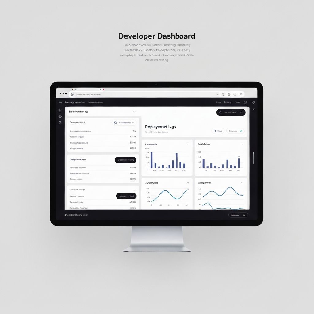
A SaaS platform wanted to make their analytics dashboard usable by business owners — not just data analysts. I redesigned the core reporting experience to surface the most important signals clearly, with a focus on progressive disclosure and contextual guidance.
“For the first time, our non-technical customers are actually using the analytics. Nimita completely changed how we think about data presentation.”
— VP Product, B2B SaaS
Challenge
Business owners were ignoring the analytics section entirely — bounce rates on the dashboard were over 80% within 10 seconds. The existing design exposed every metric simultaneously, used jargon-heavy labels, and provided no guidance on what the numbers meant or what actions to take.
Solution
I introduced a 'Highlights' layer that surfaced the 3 most important metrics each week with plain-language commentary. I restructured the full dashboard around business goals rather than data categories, added tooltips explaining every metric in context, and designed a chart system that used consistent visual language across all report types. An onboarding checklist guided new users to their first insight in under 2 minutes.
Results
Dashboard engagement increased by 3.2x. Average session time on the analytics page grew from 12 seconds to 4.5 minutes. NPS scores for the analytics feature jumped from 18 to 51. The redesign was cited in the company's Series A pitch as a key product differentiator.